Event Signage at Wed Society Austin Event at Villa Antonia in Jonestown, Texas


As a stationery and signage designer, one of our favorite parts of the creative process is dreaming up ways to surprise and delight guests with thoughtful, unexpected touches. The β€œRing for Cocktail” sign has become one of those small-but-mighty moments that makes a big impactβ€”both in-person and in photos.

Recently, we had the pleasure of designing a custom β€œRing for Champagne” sign for an event at Villa Antontia in Jonestown, Texas, celebrating wedding vendors in Austin and the Texas Hill Country. It was the perfect mix of chic and cheeky. Picture this: an elegant display, complete with an old-fashioned bell, nestled in a wall of warm green and surrounded by glasses of bubbly. The sign read, in a classic font, β€œRing for Mocktail and β€œRing for Cocktail”—inviting guests to ring a bell and watch as cocktails or mocktails were delivered through a hidden window by a white-gloved hand. Instant magic.

From a design standpoint, this piece needed to strike the right balance between elevated and fun. We pulled in elements from the planner’s design inspirationβ€”like their green color paletteβ€”to make the sign feel cohesive with the rest of the signage.

Designing a wedding Ring for Cocktail sign like this isn’t just about the wordingβ€”it’s about understanding how the moment will unfold and making sure the typography, materials, and layout support that. Will guests be reading it from a distance? Will it be a focal point in photos? Will it still look elegant after 100 people have rung the bell? (Yes, I think about that too!)

More than just a photo op, β€œRing for Cocktail/Mocktail” becomes an interactive part of the event experience. Guests giggle, toast, and come back for moreβ€”because who can resist ringing a bell for a glass of bubbly?

As a designer, moments like this are what I love most: where form meets function, and fun meets beauty. It's the kind of detail that leaves a lasting impressionβ€”and that’s always the goal.

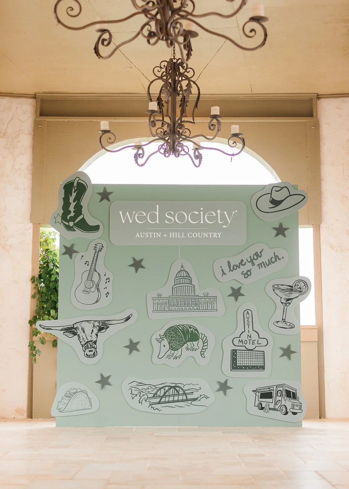
The client also wanted something custom: a structure that felt intentional and immersive, not just another β€œstep-and-repeat” moment. I proposed a grand wooden wall, painted in a rich, mossy green that complemented the natural surroundings and floral palette. Green is such a versatile design colorβ€”it’s grounding, fresh, and timelessβ€”but using it on a full-scale wall felt unexpected in the best way. We attached custom illustrations of Austin to this wooden display to make a great statement for all of Austin weddings.

What I loved most as a designer was how this backdrop created a sense of place. It didn’t just decorate the venueβ€”it transformed it. The color, the texture, the typeβ€”all carefully chosen to reflect the couple’s style and make the event feel layered and thoughtfully designed.

In a sea of white drapery and neutral palettes, this green wooden wall was a bold, refreshing twist. It proved that color, when used with purpose, can become the most elegant detail in the room.

We loved creating coordinating event wooden bar signs with these fun green elements to make the whole event cohesive.

Looking to add a champagne bell moment to your event? Let’s design something unforgettable together. πŸ₯‚

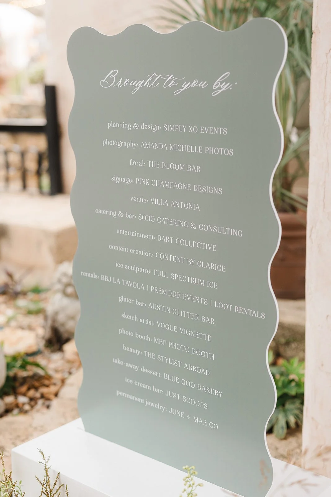
Thank you vendors: Villa Antontia in Jonestown, Texas; Wed Society Austin, Simply XO Events

 
Our WorkKelly McGraw
Hilary and Scott :: A Black and White Classic Wedding at the Arlo in Austin


We loved working with Hilary and Scott! The Arlo’s airy, loft-like ceilings and minimalist decor provide a stunning canvas. Think polished concrete floors, large windows, and yet with an intimate settingβ€”this space amplifies a clean, contemporary vibe where black and white light up beautifully and lush greenery pops.

Arriving in guests’ mailboxes are flat-printed soft blue bordered wedding invitation cards, featuring classic typography in black print. A modern yet timeless monogram adorns the top of the invitation card, which was used throughout the evening. We created a custom watercolor wedding map of Austin, showcasing highlights of the weekend and showing Hilary and Scott’s personality. Paired with Colorplan mid green envelopes, a custom watercolor venue illustration of The Arlo lined the interior envelope, hinting at the pairing of modern formality and natural charm to come.

A black acrylic wedding seating chart was beautifully displayed for guests to see, which lists guest names, surrounded by a luscious green grass across the courtyard.

We love this color palette because black anchors the palette, white adds brightness, and soft green/blue brings lifeβ€”together, they feel clean yet dynamic. And The Arlo’s modern architecture takes each detail to another level, offering the perfect backdrop.

Thank you vendors:

Venue: @eventsatthearlo
Planning: @pearleventsaustin
Rentals: @marquee_rents@premiereeventstx
Catering & Bar: @royalfigcatering
Flowers: @stemsofatx
Dessert: @bakemydayaustintx
Photography: @photohousefilms
Entertainment: @dannyrayatlanticstreetband
Stationery: @pinkchampagnedesigns
Beauty: @adoremakeupsalon
Transportation: @aroundaustin

 
Our WorkKelly McGraw
Lizzie and Chris :: An Elegant Fun Wedding at Canyonwood Ridge


As invitation designers, we have the joy of helping couples tell their story through paper. And every now and then, I get the chance to create for a wedding that perfectly balances elegance with playful spiritβ€”like this unforgettable celebration at Canyonwood Ridge for Lizzie and Chris!

We started with a color palette that echoed the Hill Country landscape in late spring: soft ivory and shades of green.. To elevate the design, we added a custom watercolor venue illustration for the top of their invitation card. We also added a coordinating Mid Green envelope liner and belly band and antique gold wax seal. The result was a suite that felt natural yet sophisticated and fun!

The main invitation was printed on thick, double-ply cotton paper using digital flat print in a soft gold ink. We paired a classic serif typeface with romantic calligraphy for the couple’s names. The layout was formal but not stuffyβ€”think timeless, with a little wink.

Designing invitations for Lizzie and Chris’s wedding was about more than paperβ€”it was about giving guests a first look into the experience the couple had planned. Sophisticated, joyful, and thoughtfully detailed, every piece we created reflected the love and excitement surrounding their big day.

Thank you vendors:

Carhart Photography, canyonwood ridge, Premiere Events The Panacea Co, Austin Catering,The Flower Girl, Sweet Treets Bakery, Say Cheese Photo Booths, Moontower Entertainment, Terra Vista Strings, Royal Fig, Twin Liquors, Ilios Productions, Around-Austin, 4Leaf Limo, Pearl Events (Maddie)

 
Our WorkKelly McGraw
Western Whimsy Meets Romantic Elegance :: Mae's Ridge Open House in Austin Texas
 
Vintage Cowboy Wedding Invitation
 

Western Whimsy Meets Romantic Elegance: A Texas-Inspired Wedding Invitation Suite. When it comes to setting the tone for your wedding, few things speak louder than the invitation suite. Infused with vintage western charm and soft romantic hues, this Texas-inspired custom wedding invitation suite is a dreamy nod to both tradition and personality.

From the vintage inspired illustrated cowgirl envelope liner to the custom boot die cut details card, every piece is a love letter to the a western theme wedding. The palette of dusty rose, blush, and soft mauve pairs perfectly with vintage postage and feminine typography, creating a cohesive look that feels both nostalgic and fresh.

We love how playful touchesβ€”like the retro pin-up cowgirl and bold cactus stampsβ€”are balanced with elegant script and floral accents. It's a beautiful example of how western-themed design can be elevated with thoughtful styling and modern details.

Whether you’re planning a ranch wedding, a city soirΓ©e with Southern roots, or simply want your invitations to reflect your heritage and heart, this suite is the perfect blend of personality and polish.

We loved creating the custom wedding bar sign mounted to the bar for all guests to see. And seating chart installation with cowboy hats, leather strips with custom calligraphy by Jennifer Smiley with 3J Designs.

Thank you vendors:

Sarah Tribett Photography, betts and Co events, Mae's Ridge, ​Officially Oaks, peak bev, hill country jennies, royal fig, vestals catering, creature coffee, imperial floor rentals, the cupcake bar, dart-collective, daughter floral, sunny hair and makeup, stradley davidson, Vannagram & Co., loot rentals, ​Sparks & Co. Events, sienna strings, noma events llc, vida film production

 
Our WorkKelly McGraw
Iris and Ty :: Natural Green Inspired Wedding at Woodbine Mansion
 
Custom Round Wedding Menus with Illustrations
 

Loved working with Iris and Ty for their gorgeous greenery inspired wedding at Woodbine Mansion in Austin/Round Rock, Texas. Creating their menus and seating chart display was such a highlight!

Forget the standard rectangle! Round menus bring a soft, sculptural element to your table design. They sit beautifully onto charger plates or dinner settings and immediately set your event apart. With the right illustration, a round menu can feel like a piece of custom stationery and a keepsake for guests.

If you want your guests to have a "wow" moment right from the start, an extra large seating chart installation is the way to go. Think: a grand, oversized wall, a freestanding sculptural display, or even multiple panels that guide guests into the reception space.

Custom round menus, oversized seating charts, and wax-sealed escort cards aren’t just trends β€” they’re ways to create a layered, luxurious experience for your guests. Each touchpoint is an opportunity to tell your story, honor your style, and set the tone for the day ahead.

Thank you again for this amazing team!

Thank you vendors:

Tia Trapuzzano

Events by Mackenzie

Woodbine Mansion

 
Our WorkKelly McGraw
Callan and Chris :: A Garden-Inspired Invitation Suite at the Arlo Austin
 
Green Watercolor Florals Custom Wedding Invitations
 

We loved working with Lexie with 787 Events and Callan and Chris for their save the dates, invitation suite, and coordinating custom day-of stationery. There’s something truly timeless about a custom wedding invitation suite that brings the beauty of nature into its design. This recent suite we created is a perfect example of how floral elements, thoughtful print techniques, and custom details can come together to set the tone for an unforgettable celebration.

At the heart of the suite is the invitation card itself, delicately adorned with colorful florals that frame the couple’s names and wedding details. The soft botanical motifs add a touch of romance, making the card feel like a page out of a storybook garden. Printed using classic letterpress with green ink, the text has a deep, tactile impression that adds richness and dimension to the design β€” a detail guests will feel valued and set the appropriate tone of the wedding day.

Nestled inside a rich green envelope, the invitation is complemented by a coordinating envelope liner featuring the same floral artwork. The liner adds a layer of surprise and elegance, greeting guests with a bloom of color the moment they open the envelope. To top it all off, the addresses are printed in crisp white ink β€” a modern and striking contrast against the green envelope and a stylish nod to the suite’s botanical palette.

One of our favorite elements? A custom-illustrated map insert, complete with watercolor icons and landmarks that highlight key locations for the weekend. It’s both practical and personal, giving guests a peek at the festivities to come and adding another touch of storytelling to the suite.

And because every detail matters, the rehearsal dinner insert features its own floral design to echo the main invitation, tying the whole suite together beautifully. The coordinating florals across all pieces create a cohesive experience from start to finish β€” one that’s elegant, inviting, and distinctly the couple's own.

This suite is proof that when artistry meets intention, the result is something guests will treasure long after the big day.

To carry the personalized details into the wedding day itself, we designed custom matchboxes β€” a charming and functional favor guests could take home. At the bar, a custom sign featuring a watercolor dog illustration of their beloved pup added a playful, personal touch, perfectly paired with coordinating koozies that kept drinks cold and spirits high. The dinner tables were adorned with floral menus tied with soft silk ribbon, adding a layer of elegance to each place setting. And to guide guests to their seats, a dusty blue seating chart display stood out in the most graceful way β€” both beautiful and practical, tying in effortlessly with the suite’s color palette and overall design story.

Thank you vendors: 787events, thearlo, crave-catering, specs, Caroline Lima Photography, ohhappydaybooth, texasprodj, terravistastrings, AdoreMakeup, iliosproductions, whimhospitality, premiereevents, lootrentals, tablemannerstx, centerstagefloors, remiandgold, simonleebakery, pinkchampagnedesigns, bigdogpyro, alphalitausti, around-austin, atxclassiccars

 
Our WorkKelly McGraw
Maddie and Steve :: A Wedding with a Cheerful Splash of Color at Camp Lucy Austin


When it comes to setting the tone for your big day, your invitation suite is the first glimpse your guests will have into the celebration aheadβ€”and this one is all about joy, personality, and fun color.

This particular suite for Maddie and Steve is a dream for couples who love to do things a little differently. Think: a kaleidoscope of cheerful hues, a bespoke watercolor monogram featuring the couple’s beloved cat, and lush floral illustrations that feel like they were plucked straight from a summer garden.

From the moment you open the envelope, the invitation suite bursts with personality. Gone are the muted tones and minimal designsβ€”this suite leans into COLOR in the best way. Punchy pinks, sunlit oranges, vivid blues, and fresh greens all dance across the paper in a playful, coordinated palette. Every elementβ€”from the save the dates to the RSVP cardsβ€”feels like a mini celebration on its own.

At the heart of the suite is a custom watercolor monogram unlike any other. Nestled between delicate vines and florals is the couple’s sweet gray tabby, rendered in charming watercolor with just the right mix of realism and whimsy. It’s a personal nod to their furry family member and brings a cozy, heartfelt touch to the entire suite.

The monogram isn’t just limited to the invitationβ€”it was carried through to the envelope liners, wax seals, and even the cocktail napkins for the big day. It became a true signature element of the wedding design.

Watercolor florals weave their way throughout the suite, bringing in texture, movement, and an organic feel. Inspired by the couple’s garden-style wedding, the florals include peonies, ranunculus, and wildflowers in vibrant, saturated tones. They spill across the details card, wrap the border of the invitation, and peek through translucent vellum wraps like a blooming secret.

To tie it all together, the suite was packaged with a soft pink blush silk ribbon with coordinating soft blush wax seal.

This suite is proof that wedding invitations can be equal parts elegant, personal, and joyfully unexpected. It’s a celebration on paperβ€”one that reflects the couple’s love, their story, and yes, even their cat.

To tie the custom wedding invitation suite to their day-of stationery, we included their custom wedding monogram on the table numbers and their beautiful cheerful florals on the wedding menus, custom seating chart, and more.

If you're dreaming of an invitation suite that feels like youβ€”bright colors, beloved pets, or anything in betweenβ€”custom design is the way to go. It's a chance to infuse every detail with meaning and magic. Because your love story isn’t one-size-fits-all. Your invitations shouldn’t be either.

Thank you vendors:

Photo: @thecrakes

Planning: @pearleventsaustin

Venue: @camplucyweddings

Floral: @stemsofatx

Beauty: @lolabeautyatx

Stationery: @pinkchampagnedesigns

Linens: @bbjlatavola
Lounge: @lootrentals

Dancefloor: @centerstage_floors

Cake: @michellespatisserie

Band: @loveandhappinessband

Ceremony/Cocktail: @moontowerentertainment

Transportation: @uptownvalet

 
Our WorkKelly McGraw
Whitney and Jonathan :: A Luxury Wedding at Dallas Country Club


We were honored to work with Whitney and Jonathan for their lux black and white-themed wedding at Dallas Country Club, layered with abundant florals and refined elegance.

The invitation suite is timeless, dramatic, and sophisticated, designed to reflect the grandeur of a formal, black and white wedding. The focus is on rich textures, classic typography with modern flair, and thoughtful layering of elements. The wedding invitation was printed digitally on a card stock that is thick, double-weight cotton cardstock in eggshell white. The font is a mix of high-contrast serif fonts (for readability and formality) paired with ornate flourished calligraphy for names and key details. The wedding envelope is a deep black matte envelopes, with a smooth or slightly textured finish (like vellum or cotton paper). The custom wax seals is a processo gold wax seal for an added luxury look and for a bit of shine.

For their day-of stationery, we coordinated the design for their wedding reception menus with names printed on the menus for a personal touch and seating assignments at the tables. We also designed their wedding table numbers with an arch design, custom fan accordion fans for the wedding programs, custom cocktail napkins, drink stirrers, custom pet portrait bar signs, guest book sign, wedding welcome itinerary, wedding welcome notes, shabbat menus, and custom wedding pizza box stickers. For the escort card wall display, we printed guest names on envelopes so guests could open their personal messages inside each envelope.

We loved designing this wedding with Whitney and team!

Thank you vendors: John Cain Photography, Dallas Country Club

 
Our WorkKelly McGraw
An Evening at Jo Malone at the Domain Austin
 
Bow Wedding Bar Menu
 

At Pink Champagne Designs, we believe that every detail contributes to an unforgettable event.

This partnership is a perfect fusion of refined aesthetics and seamless event execution. Jo Malone, known for its timeless fragrances and elegant ambiance, set the stage for a sophisticated affair. To enhance the experience, we provided beautifully designed event signage that not only guided guests but also elevated the event’s overall aesthetic with Noma Event Rentals.

Why Signage Matters

Event signage is more than just practicalβ€”it’s an extension of the brand and the experience. For this event, we created a classic black and white custom bar sign with signature cocktails for weddings and events, welcome sign with real black ribbon adhering to the top with our black box for wedding signs to display the grand welcome sign, and minimalist place cards at each place setting. We focused on:

  • Aesthetic Harmony: Signage that seamlessly blended with Jo Malone’s sophisticated brand identity.

  • Guest Experience: Clear and stylish wayfinding that enhanced the flow of the event.

  • Brand Presence: A subtle yet impactful showcase of our partnership and dedication to excellence.

Looking Ahead

We are excited about future collaborations that bring together the best in event design and execution. Whether it's luxury signage, bespoke rentals, or immersive brand experiences, we look forward to continuing to craft memorable moments.

Stay tuned for more updates, and if you're looking to elevate your next event with beautifully branded signage, let’s create something extraordinary together.

Thank you vendors:

Planner| Betts & Co | Taylor Betts | @bettsandcoevents

Florals | @daughterfloral

Venue & Host | Jo Malone London Boutique - @thescentofatx

Rentals & Host | NOMA Event Rentals | @noma_eventsatx

Photography | Sarah Tribett Photography | @sarahtribettphoto

Furniture Rentals | Party at the Moontower | @moontowerrentals 

Linens | Stradley Davidson | @stradleydavidson

Signage | Pink Champagne | @pinkchampagnedesigns

Bartending | Chapter Social + Spirits | @chapter.tx 

Alcohol | High Desert Cactus Vodka | @highdesertvodka

Charcuterie | Charcuterie Mix and Co | @charcuteriemixandco 

 
Our WorkKelly McGraw